Recently our photography students have been working on portraits, studying different types of lighting and backgrounds as part of the Contrast course. On the technical side they’ve been learning how to use studio lighting and natural lighting to capture the physical nuances of their subjects, while artistically learning what backgrounds and what moments share personality.
Here are some of the photos, with descriptions:
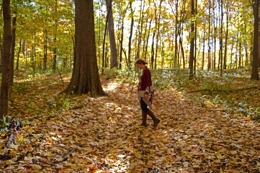
Britt’s portrait of her friend Kayla is poetic and even spiritual, showing her subject on a journey through the woods. Britt’s portrait is in stark contrast to Josh’s portrait below – we don’t get to look into Kayla’s eyes or even see detail in her features, as the background and the streaks of light dominate.
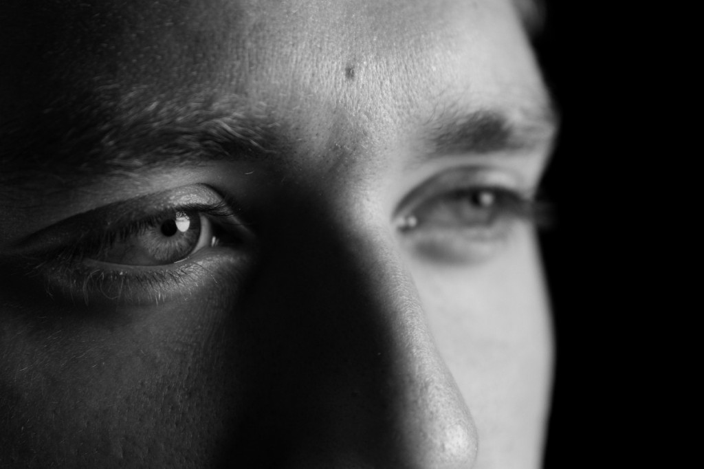
Josh’s portrait of his friend Tim emphasizes just a part of the face – specifically the right eye, by using shallow depth of field and close cropping. Josh wanted to create a sense of intimacy and intensity, relying on studio lights and a black seamless background.
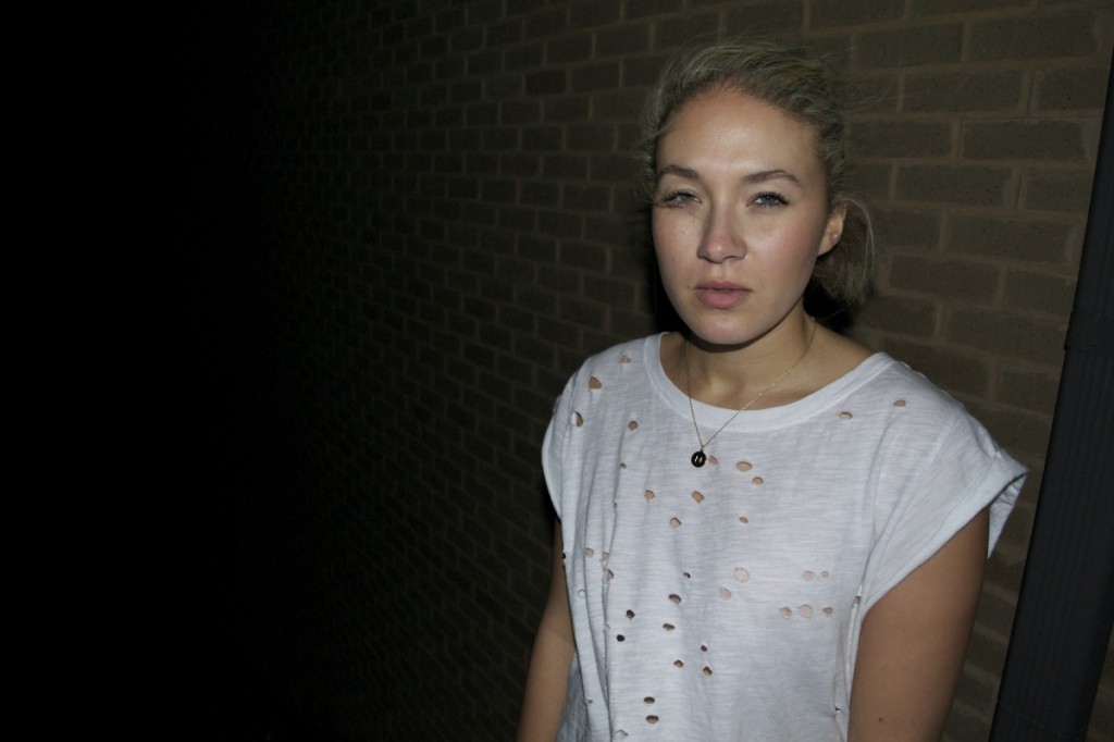
Jordan wanted her portrait of her sister to feel edgy and spontaneous, so she used a fill flash on a windy night.

Brooke’s portrait of Michael gives us insight into his personality through the iconic background. Brooke also applied a subtle vignette in order to add intensity and drama, darkening the corners of the photo and drawing viewers inward to Michael’s gaze.

Anne Gouty’s portrait of her dad holding her niece shows a candid moment. The shallow depth of field and the directed glance from her dad underline the emphasis on her niece’s face.
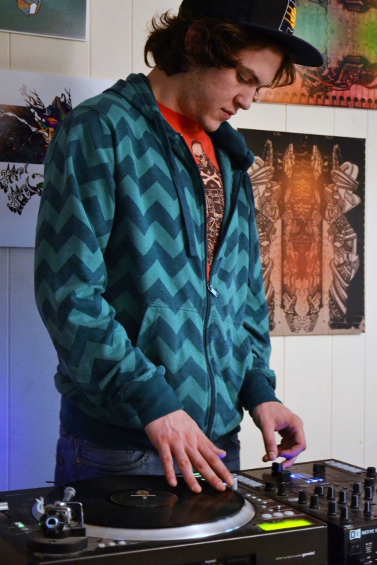
Bekah wanted to show off Nick’s dual talents as a DJ and visual artist by capturing him using his turntable in his studio. One of her questions at our critique: should the background be out of focus? Her peers urged her to show this version, where viewers can see Nick’s drawings clearly, rather than an alternate version where the drawings were unreadable. It became more important to show the details of the drawings themselves, rather than further emphasize Nick’s profile through shallow depth of field.