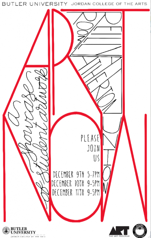
As students begin their projects for their art history survey class, ART105 Introduction to Visual Culture, they are encouraged to think about creating “portfolio-ready” pieces – works that will help to show their creative skills to prospective employers after they graduate. Students majoring in Art+Design have many career options, and their choice of media on the ART105 project frequently reveals one or more possible career paths. The projects are due at ART NOW, our end-of-semester huge exhibition, but in a preview critique it was revealed that their are students working this year with graphic design, painting, drawing, tattoo design, t-shirt design, functional objects and sculpture! Below are examples of styles and cultures studied during the latter portion of the class illustrated by students’ projects from last year — to see this year’s please join us at ART NOW December 9-11 (opening December 9, 5-7 p.m. and open 9-5 on December 10 and 11, in the Reilly Room in Atherton Union).
This post is a continuation of the September 28 post – there we took a look at some of the styles and cultures the class had covered up to that point, including Prehistory, Ancient Sumeria and Egypt, Ancient Greece and Rome and Byzantine and Gothic periods.

The second unit for the class included the Italian Renaissance, Mannerism and Baroque–the penchant for theatricality in this latter style is brilliantly captured by Art+Design major Kaylin Greer (’17), who chose to make logos (graphically-illustrated concept pieces that in a career context would represent corporate identity production). With just a few key elements, Kaylin captures not only theatricality (indicated by the stage and drapery) but also the frequent appearance of a spotlight effect in works from this period and the tendency for asymmetrical compositions that suggest diagonal movement. Her choice of typeface suggests another aspect of the Baroque style from 17th-century Europe – a penchant for elaborate styling.
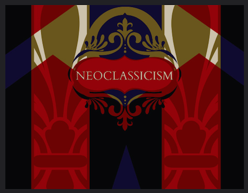
Kaylin’s logo for Neoclassicism demonstrates that this style (from the late 18th and early 19th centuries) preferred symmetry and references to classical antiquity–the use of forms suggestive of Fleur de Lys suggests both the French origin of the style and its appearance as a reaction to the decadent Rococo style associated with Louis XIV).
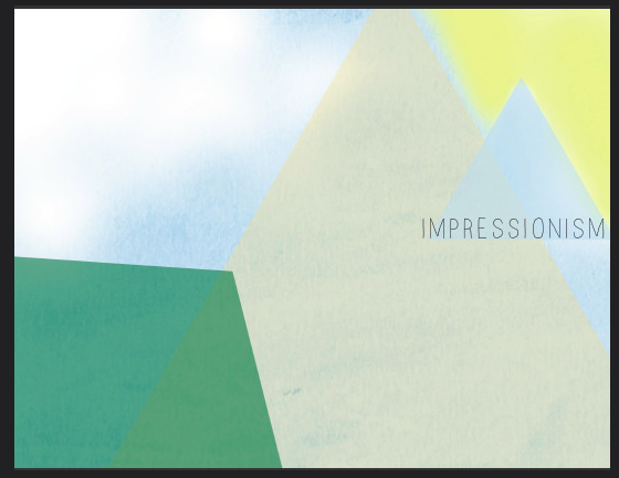
For the Impressionism logo the focus is on light and color–there is a careful reference to atmospheric perspective and also an allusion to a particular painter–Paul Cezanne–who would transition into a Post-Impressionist and famously declare that he wished to make Impressionism seem more weighty and permanent “like the art in the Louvre”–eventually his drive for a geometrically-ordered nature would inspire Picasso to create cubism. Another Post-Impressionist, Georges Seurat, inspired Josh Gaal (’16) to create the image below.
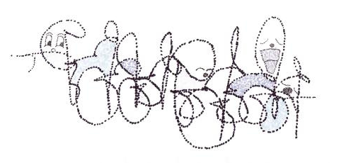
Josh focused most on Seurat’s application of paint in tiny dots (called “pointillism”).
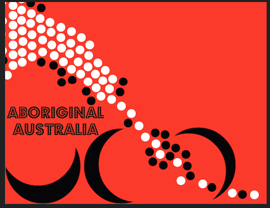
The Australian Aborigines also applied pigment using dots, but for a much different effect. While Seurat was interested in the science of light and color (and so the subject matter was a distant secondary consideration), for Aboriginal Australians the dots connote “Dreamtime” – the time of their elders – and so contemporary paintings using this style are a post-colonial hybrid of past and present, but most importantly retain aspects of culture that are meant to be understood only by its members. In her logo Kaylin has intentionally used abstract forms to suggest the stylistic aspect of the dots and to focus on the transmission of that culture over time.
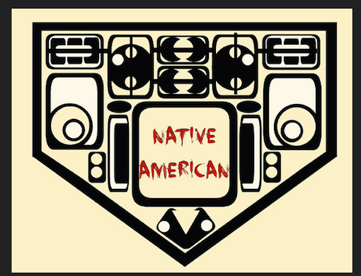
Kaylin conducted a similar translation in her logo for the Native Americans of the Northwest coast, more specifically the work of the Tinglit people. In this work Kaylin references both weavings and carvings that contain abstracted animal forms (totems) using distinctive ovoid shapes with strong formlines.
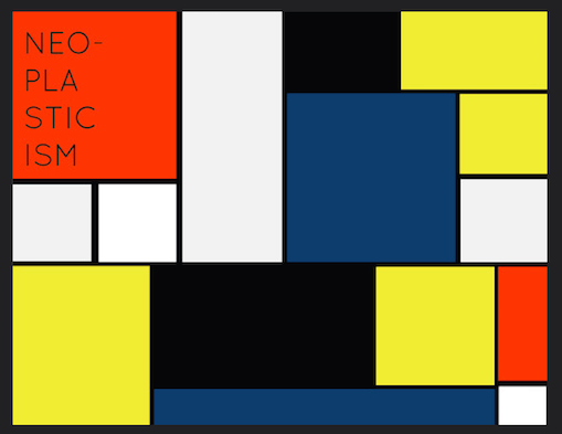
A strong sense of shape also defines Kaylin’s logo for Neoplasticism–this is a style developed specifically by Piet Mondrian in the 1930s (Mondrian believed that his careful balance of primary colors and rectangular forms could bring harmony to war-ravaged Europe)
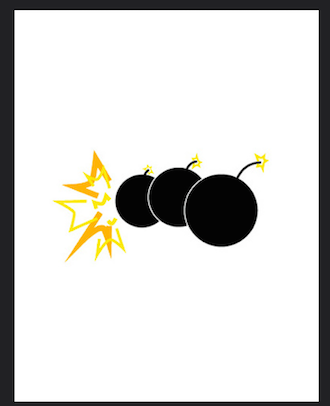
Amber Mill (’14) designed a logo that captured the more active side of conflict in the early-twentieth century. While Mondrian lived in The Netherlands (a neutral country), in Italy a group of artists called the Futurists embraced war, speed and technology. They took an anarchistic approach, believing that the only way to move forward was to destroy the present–Amber captures both the incendiary nature of the movement and also the tendency to use repeating forms to capture movement in progress.
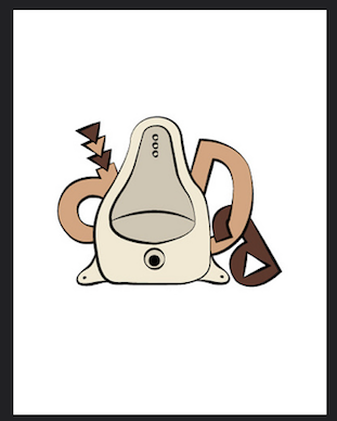
The artist who initiated Dada, Marcel Duchamp, began his career using the movement-catching approach of the Futurists, but his work became a protest to war rather than a celebration of it. Here Amber captures his most famous piece–a urinal-turned-sculpture he titled “Fountain.” The Dadaists would embrace the random accident and create compositions that intentionally seemed disjointed or even playful. The choice of font, reminiscent of the “barrel of monkeys” game, cleverly suggests the literal meaning of Dada. French for “hobby horse,” the Dadaists claimed to have selected the term at random from a French dictionary, but were happy with a result that suggested childhood innocence.
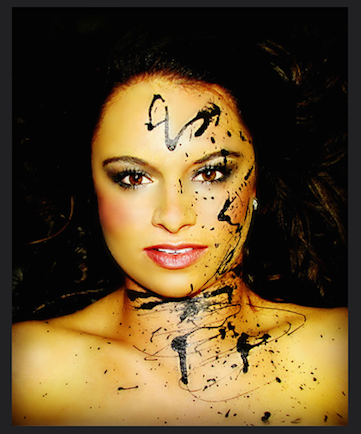
The Abstract Expressionists would be influenced both by nihilistic Dada and the more positive Surrealist movement it morphed into. In this photograph Brooke Dominguez (’16) captures Jackson Pollock’s “action style” painting–his distinctive strokes, created by throwing paint on the canvas, revealed his process–the style suggests the automatism of the Surrealists that was believed to reveal subconscious creativity.
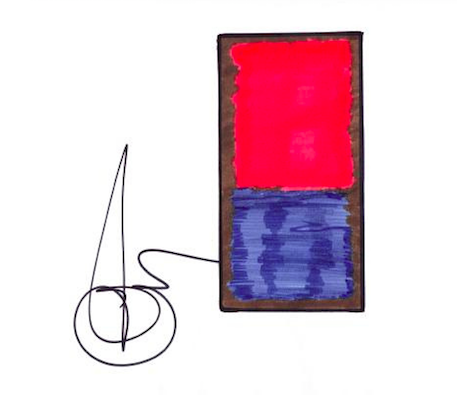
Josh Gaal channels one of Pollock’s contemporaries, Mark Rothko, whose style of soft floating squares on a rectangular ground received the name “color field” painting.
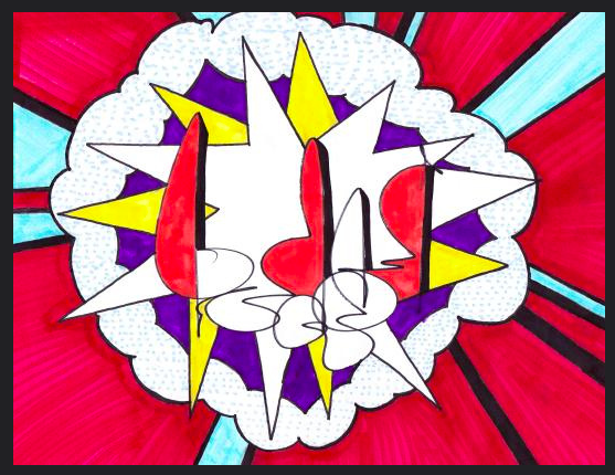
Pop Art, also illustrated by Josh Gaal, combined the “readymade” Dada approach with the bright colors and graphic forms associated with 1960s American popular culture. Josh captures the spirit of Roy Lichtenstein’s Whaam! (in the collection of the Tate in London) but without literally copying it. Pop Art also represents a transitional moment between Modernism (art work from roughly Impressionism to the 1960s which focused on the formal elements of art and promoted the idea of “art for art’s sake”) and Postmodernism (work from the late 1960s to the present which gave more power to the concept than the formal elements).
By studying art history and visual culture from prehistory to postmodernism, Art+Design majors develop an important repertoire of historical knowledge and learn to place their own work into the constantly-evolving trajectory of art history created by museums and galleries. But beyond just memorizing these styles, Art+Design students learn by creating work that represents their personal style while simultaneously demonstrate that knowledge.