
By Adam Azman, Chemistry Department
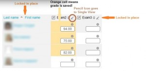
In my first post, I expressed my frustration with the non-intuitive grade calculation. My second biggest complaint with the old gradebook was the main Grader Report page. Remember when you used to scroll down to find a student you wanted, but then you couldn’t see the grade item names anymore? Not anymore! The intuitive scrolling in the gradebook ‘locks’ the names and assignments before they scroll off the screen. You’ll always know what student row and what assignment column you’re editing.
That big improvement accompanies one other major upgrade: Autosave! In the Grader Report, as you input grades, the cell turns orange. This is not a warning, it’s a confirmation that your grade has been Autosaved. No buttons to click to update or lost grades when you accidentally close the browser. Moodle automatically saves each grade entered and lets you know by highlighting the cell orange.
But there are two other smaller improvements which all help make the upgraded Grader Report page much better.
Remember the new Single View page from the first post? The Grader Report page now includes pencil icons next to each student and grade item to immediately take you to the Single View page for that selection.
Finally, you can find students faster with the filters at the top of the Grader Report. View only students whose last name begins with S with one click. Your view will become less cluttered, and you will be less likely to input a grade in the wrong place.
These may not seem like dramatic changes, and you probably won’t even notice how much more efficiently you’re updating grades in the gradebook. But your students will notice. And when you look back in November, you’ll think back to how the gradebook used to be, and you’ll realize how much less of a headache it is now.